
The eighth book of the “11+1” series by North Light Press, S. Gayle Stevens’s book Calligraphy intertwines two ideas: beautiful line drawings and the memento mori. A Chicago-based artist, Stevens works in alternative photographic processes, specifically the wetplate collodion tintype, and in her artist statement for the series, Stevens links the “sparse yet expressive” brushstrokes in calligraphy to the photogram of a black silhouette featured on each 5-inch square tintype. The body of work, then, becomes a message on antiquity and decay.
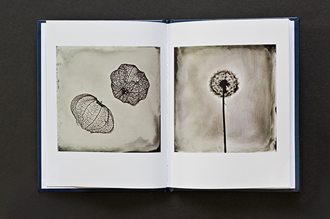
Each tintype displays one plant or specimen that Stevens found on walks near her home or while traveling. Each item had been discarded and overlooked, and Stevens’s collecting and photographing them seems inspired by the seventeenth century “cabinets of curiosity,” the forerunner to our modern-day museums. In her photographs, Stevens creates a momento mori, curating her own exhibit of curious plants and animals that, though seemingly preserved in the photographic process, turn toward impermanence. Much like the subjects of her art, the tintypes themselves are prone to decay; left unvarnished, each plate will slowly tarnish over time.
Buddhist conceptions of impermanence are central to the Chinese culture that gave birth to calligraphy, and while the bold lines of many of the Stevens’s images hearken to an ancient written text, the ancestry is not literal. Instead, Stevens uses the discarded objects of our lives as text and form to provide some sense of the language of decay. Comparisons between her preferred historical processes, ancient Chinese drawings, and seventeenth-century taxonomic exhibits come together to forge strong connections between the past and present. By becoming more aware of the ancient, the outdated, and the overlooked and discarded, we become more attuned and aware of the present. We may even consider more carefully what we preserve and what we disregard.

Given the way that Stevens’s work asks us to consider what we value, her publishing Calligraphy with North Light Press is fitting. The press’s “11+1” series is made up of 5x7 cloth-bound, limited-edition, hardcover books. Each has eleven pages of high-quality, single print reproductions of the artist’s work and a single original print that is signed and numbered by the photographer. As part of the series, Calligraphy maintains the same size and basic layout of the first seven books, but the original work included with each book is not a signed and numbered printing of an image. Instead, it is a 2-inch square tintype that is part of a larger collage of 100 tintypes. Each piece stands alone, but in size it reminds us that it is part of something else. It is a letter that has been cast off from a larger concept, a calligraphic symbol that will remain always and essentially a piece of a collection that can never be put back together again. Like the momento mori, it can only glancingly remind us of what we may have lost.
Calligraphy is available from North Light Press.
Pam Gilmer is an intern at The Kiernan Gallery and a student at Southern Virginia University.
This article was first published in Issue 1 of Don't Take Pictures.