Each month an exclusive edition run of a photograph by an artist featured in Don't Take Pictures magazine is made available for sale. Each image is printed by the artist, signed, numbered, and priced below $200.
We believe in the power of affordable art, and we believe in helping artists sustain their careers. The full amount of the sale goes to the artist.
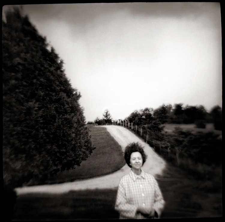
We are pleased to release January's print, Girl in Jodhpurs from Susan de Witt.
Read more about de Witt's work below.
Purchase this print from our print sale page.

Girl in Jodhpurs
6 x 9, signed and numbered edition of 5
Archival inkjet print from lith original
$95
Susan de Witt: STARK
There is something inherently beautiful about a woman’s figure, especially when all outside influences and elaborations are taken away. We are left with a curvy form—and our imagination. The possibilities of what we are able to create in our own minds relating to that form are nearly endless. Susan de Witt in her series, Stark, portrays the power of this phenomenon and the artistic oblivion that is traveled when invoking a single, beautiful subject, devoid of all extraneous context.
Stark was birthed from curiosity rooted in the mind of a young child—the need to understand and be embraced by the adult world on a deep and intimate level. De Witt speaks intently of the curious nature of her youth, specifically reminiscences of the glamorous—and equally mysterious—cocktail parties her parents would attend, both inside their home and in others’. She has fond memories of watching her parents transform into host and hostess, dressed, appropriately, to the nines. De Witt distinctly recalls the small booklet that her father referenced when making drinks for their guests. A handheld cocktail bible, the booklet illustrated not only recipes for adult beverages, but angular black and white graphic drawings of party goers enjoying those drinks, with detailed images of women drenched in elegance wearing gloves and hats and long flowing dresses. Those images that de Witt studied for so long began her love for lith printing, and the subject matter of her early memories emerge in this series.
The same curiosity that kept de Witt intrigued as a youngster has stayed with her through adulthood. It can be witnessed in each of her bodies of work, as there is an inherent challenge posed as it relates to lith printing as well as black and white development. Each of the pieces in the work exemplify the artist’s need to explore the range of possibilities when details in the negative are removed. Simple outlines are highlighted beautifully, creating an ethereal space in which the viewer can determine for him/herself what it is he/she is viewing. Lith printing allows for overexposure to create drastic dark and light opposites, a process de Witt is clearly well versed and comfortable in. This graphic version of printing permits the artist to relay her message, even if the content is ultimately left to the imagination of the viewer.
For example, in “Billy in Lace Dress” passion is difficult to escape. The brunette’s seemingly half-shut eyes, her elongated neckline, accompanied well by the deep plunge of the model’s lace dress, leads to an internal longing in the viewer. The journey from face to body is effortless, beautifully and simplistically so, and creates a safe space for the viewer’s mind to wander from lust to pure adoration for the shadowy, black and white form. The subject of this particular piece is not “Billy,” but a universal woman with a perfectly proportioned silhouette, and, generally, pleasing body form. The contrasts of light and dark push the viewer into a deeper sense of who this woman is—an understanding that she is beautifully unreachable yet somehow equally available to those who may be able to meet her needs.
Paradoxically, the more control the artist has in the development of negatives through the lith printing process, the greater level of control is given to the viewer to interpret a work in a personal and, therefore, intimate way. This creative and at times challenging process results in artwork that is more suggestive than conventional black and white prints. As color exists prior to the process, toning through lith printing creates an end product that marries delicacy of light with coolness of shadow. The illusions breathed into de Witt’s photographs are just that: illusions of our own minds. They are warm in some aspects, yet heartless and cold in others, but they all ultimately occupy a comfortable space that combines soft and subtle imagery with pure grit. The varied degrees of contrast that can be seen with lith printing are evident as well, with the juxtaposition of flowing whites that melt together against grainy, colder blacks. All work together to form an evocative aesthetic.
Unwavering beauty can be seen in “Stark #3,” as de Witt takes us on a less processed journey back to the cocktail party voyeurism of her youth. With a hint of the roaring 20s, the clear silhouette presents a striking image. The tonal contrasts, which create a clear separation between the subject’s simplistically beautiful face and the mystery that surrounds her, cannot be overlooked. The difference in depth between the half veil covering the model’s eyes and the clear angles of the jaw and hairline draw the viewer’s eye. These sharp cuts effortlessly blend into the much brighter shoulder line that, because not cleanly defined, allows for an air of mystery to permeate the piece. It is clear to see de Witt’s mastery of the lith process in this work, as fewer exposures were necessary to achieve the desired outcome.
In contrast, “Eyes of Velvet” portrays a completely different perspective of the female form even if it invokes a similar level of intrigue through de Witt’s use of blurred lines. As in all of her work here, the viewer’s imagination delineates and fills in the story. To some, the subject may appear to be wearing a headpiece, while for others her hair is simply morphing into the dress she is wearing. Still, the female form remains the unquestioned subject, and the figure’s beauty lingers in the mind of the viewer, even if the woman’s identity—or purpose—can never really be known. Again, de Witt is able to create an illusion of shadow and light that requires the viewer to take another, more intentional glance.
Throughout the Stark series, the artist is suggesting a single purpose for the viewer: “Spend time with her; get to know her as much or as little as you’d like, and then make your determination as to who she truly is.” De Witt’s control of lith processing as an outlet for her vision paves a clear path for a spark of the imagination, inviting the viewer to see, to imagine, and to know. The work requires confrontation with personal understandings of beauty. A focus on form, whether defined or vague, can be unique to a viewer’s experience or an assertion of societal norms, but de Witt’s work suggests that regardless of the origins of the idea of beauty, the female form embodies it. The images presented in Stark speak to the truth that beauty is in no way clearly defined by shapely silhouettes or symmetrical faces alone; instead, the individual decides what is to be deemed beautiful. The viewer, seeing only the form, fills in his or her own story when all the distractions are left out.
Melissa Horton is a freelance writer in Alexandria, Virginia, with an eye for photographic art. Most notably, she is a contributing columnist for elephant journal.